Traffic is up 40%. Signups hit a new record. Your dashboard is a wall of green arrows.
And MRR has not moved in three months.
If that sounds familiar, your product is probably fine. Your measurement is not.
Most SaaS dashboards are built around numbers that are easy to collect and nice to look at, but that have no direct line to someone paying you.
Those are vanity metrics, and they can hide a revenue problem for a very long time.
This guide shows you which SaaS metrics don’t matter as much as you think, which ones actually predict revenue, and how to rebuild your dashboard in an afternoon.
What are vanity metrics in SaaS?
A vanity metric is a number that looks like progress but doesn’t tell you whether your business is getting healthier. Eric Ries popularized the term in a 2010 Harvard Business Review piece, Entrepreneurs: Beware of Vanity Metrics, and later in The Lean Startup.
Vanity metrics usually share four traits:
- They only go up: Cumulative totals (all-time signups, total users) can never fall, so they always look like growth.
- They count attention, not value: A visit, a click, or a follow says someone looked. It doesn’t say they got anything done.
- They have no owner: Nobody on the team knows what to change when the number drops.
- They can’t be split: You see one big number, not which channel or cohort produced it.
None of this means the numbers are useless. It means they are context, not goals.
Why your dashboard looks healthy while revenue stays flat
Four common reasons the green arrows and the bank account disagree.
1. Traffic has drifted away from buying intent
Search now answers many questions before anyone clicks. In a Pew Research Center study of 900 U.S. adults, people clicked a traditional search result on 8% of visits when Google showed an AI summary, versus 15% when it didn’t.
Ahrefs’ February 2026 update found AI Overviews now go along with a 58% lower click-through rate for the top-ranking page.
What that means for you:
- The visits you still get are a different mix than they were two years ago.
- Pageview totals can rise or fall for reasons that have nothing to do with buyers.
- Some of your most valuable visitors now arrive from AI assistants, and a plain pageview count hides that. We cover this shift in how AI Overviews are changing SaaS analytics.
2. You’re counting accounts, not people who got value
A signup is a promise, not a customer. Userpilot’s SaaS product metrics benchmark puts the average activation rate at 37.5% across 62 B2B SaaS companies.
Put simply, roughly six out of ten new users never reach the moment your product proves its worth. Your signup chart counts all of them.
3. You’re shipping features nobody touches
Release counts feel productive. But Pendo’s Feature Adoption Report, based on feature usage across 615 Pendo customer subscriptions, found that 80% of features in the average software product are rarely or never used.
The report dates from 2019, yet it is still the most cited study on the topic, and Userpilot’s newer data points the same way: average core feature adoption sits at 24.5%.
4. Retention is thinner than it looks
The 2026 Aleph x Benchmarkit SaaS benchmarks (full year 2025 data, 342 companies) put median net revenue retention at 102% and median gross revenue retention at 84%.
In plain terms, at the median, about 16% of existing revenue churns or shrinks each year, and expansion revenue has to cover that gap.
If your dashboard celebrates new signups and ignores what happens after month one, you are filling a leaky bucket faster and calling it growth.
7 SaaS metrics that don’t matter (as much as you think)

Each of these is fine as background. Each becomes a problem the moment it turns into a goal. Here is why, and what to track in its place.
1. Pageviews
- Why it looks good: It’s the biggest number on almost every analytics tool.
- What it hides: Who those visitors were and whether any of them signed up. One bot spike or viral post can double it overnight.
- Track instead: Signups and paid conversions by landing page and by source.
2. Total signups
- Why it looks good: It feels like demand.
- What it hides: The large share of people who sign up, look around once, and never come back.
- Track instead: Activation rate, the share of new signups who complete your key “aha” action.
3. Total registered users
- Why it looks good: It only ever goes up.
- What it hides: How many of those users are still active. A cumulative total can grow while your active base shrinks.
- Track instead: Weekly or monthly active users who used your core feature, plus the share who behave like power users.
4. Average session duration
- Why it looks good: Longer sounds like more engagement.
- What it hides: In a SaaS app, a long session can mean someone is lost. We break this down in average session duration.
- Track instead: Time to value, meaning how long it takes a new user to reach their first win.
5. Bounce rate on its own
- Why it looks good: A falling bounce rate feels like a better site.
- What it hides: A pricing page visitor who reads everything and leaves still “didn’t bounce.” See the bounce rate formula for how it’s calculated.
- Track instead: The conversion rate from that page to the next meaningful step, such as signup or checkout.
6. Social followers and impressions
- Why it looks good: Reach is visible and easy to screenshot.
- What it hides: Whether any of that reach turned into a trial or a paying account.
- Track instead: Signups and paid customers by referrer, so you can prove marketing ROI channel by channel.
7. Number of features shipped
- Why it looks good: It shows the team is busy.
- What it hides: Whether anyone uses what you shipped (remember Pendo’s 80%).
- Track instead: Feature adoption rate for every release, and whether adopters retain better than non-adopters.
A note on MRR: Monthly recurring revenue is not a vanity metric, but on its own it is a lagging one. By the time MRR dips, the behavior that caused it happened weeks ago. Pair it with the leading metrics below.
What metrics actually predict revenue?

The metrics that predict revenue in SaaS measure what users do before they pay, upgrade, or cancel.
Here are seven that correlate with revenue much more directly than traffic does, with the latest public benchmarks where they exist.
1. Activation rate
- What it is: The share of new signups who complete the action that delivers your product’s core value (sending a first invoice, creating a first project, inviting a teammate).
- Why it predicts revenue: People rarely pay for a product they never got value from. Activation is the gate every paying customer walks through.
- Benchmark: 37.5% average, 37.04% median.
2. Time to value
- What it is: How long it takes a new user to reach that first win.
- Why it predicts revenue: Every extra day is another chance to get distracted, especially during a free trial.
- Benchmark: About 1 day and 12 hours on average across 62 B2B SaaS companies. Here’s how to reduce SaaS time to value.
3. Core feature adoption
- What it is: The share of active users who regularly use the feature your pricing is built around.
- Why it predicts revenue: Users who depend on your core feature are the ones who renew and upgrade.
- Benchmark: 24.5% average, 16.5% median.
4. Early retention by cohort
- What it is: Of the users who signed up in a given week or month, how many are still active 30, 60, and 90 days later.
- Why it predicts revenue: Retention curves that flatten out early are the clearest sign of product-market fit. Curves that keep sliding toward zero mean revenue will follow.
- Benchmark: 46.9% average month 1 retention across 83 companies. Learn the method in our cohort analysis guide.
5. Signup to paid conversion by channel
- What it is: For each traffic source, the share of signups who become paying customers.
- Why it predicts revenue: It tells you where your next dollar of marketing should go. A channel with half the traffic and twice the paid conversion is the better channel.
- How to measure it: Connect the first visit (with its referrer or UTM tag) to the signup and the payment event for the same user.
6. Product qualified leads (PQLs)
- What it is: Free or trial users who have hit usage signals that historically come before an upgrade.
- Why it predicts revenue: A PQL is a forecast of next month’s new revenue, built from behavior instead of form fills. See our PQL definition and scoring model.
7. Net and gross revenue retention
- What it is: Net revenue retention (NRR) is how much revenue you keep from existing customers after churn, downgrades, and expansion. Gross revenue retention (GRR) is the same without expansion.
- Why it predicts revenue: In the Aleph x Benchmarkit data, companies growing faster than 50% a year had a median NRR of 111%, while those growing under 10% sat at 92%. Strong retention and fast growth go hand in hand.
- Benchmarks: 102% median NRR and 84% median GRR across 342 companies (Aleph x Benchmarkit, 2025 data). For bootstrapped companies with $3M to $20M in ARR, SaaS Capital’s survey reports 103% median NRR and 91% median GRR. Our NRR playbook shows how usage data drives both.
Notice the pattern: metrics 1 to 6 are leading indicators you can move this week. Metric 7 is the result they produce a few months later.
Should you stop tracking pageviews in your SaaS?
No. Stop reporting pageviews as a goal, but keep collecting them.
Pageviews are the raw material for real metrics. They just aren’t a result.
Pageviews are still useful when you use them to answer a specific question:
- Which pages show up most in the journeys of people who later paid? That tells you which content earns revenue, not just traffic.
- Which blog posts send visitors to your pricing page or signup form? That’s content ROI.
- Where do visitors arrive from? Search, social, direct, and AI assistants like ChatGPT behave very differently. Our guide to website traffic sources covers what each one tells you.
- Did something break? A sudden drop on a key page is a great early warning.
The shift is simple. Treat a pageview as one step in a user’s path, not as the finish line. That is the core difference between web analytics and product analytics: one counts visits, the other follows people.
How Vemetric helps you measure what actually drives revenue
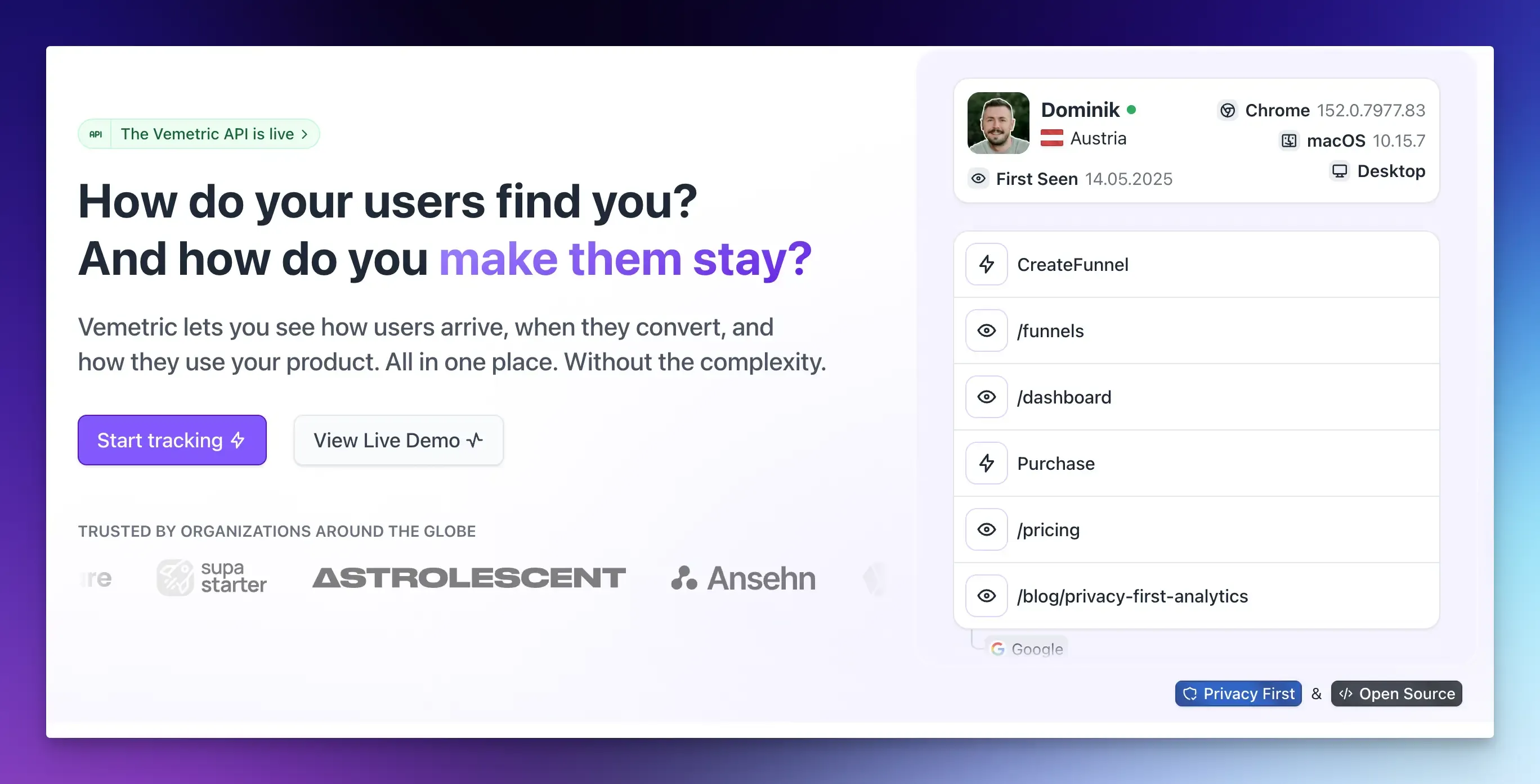
Most teams track vanity metrics for one reason: the real ones used to need three tools.
A web analytics tool for traffic, a product analytics tool for behavior, and a spreadsheet to stitch them together.
Vemetric puts web and product analytics in one place, so you can follow a user from their first visit to their first payment.
- See where valuable users come from: The dashboard shows top pages, referrers, UTM campaigns, and countries, and it detects visits from AI assistants such as ChatGPT as their own referrer type.
- Track the actions that matter: Send custom events from the browser, or from your backend with SDKs for Node.js, PHP, Python, and Go, so payment and upgrade events land in the same place as pageviews.
- Connect visits to people: User identification merges a visitor’s anonymous and logged-in activity, so you can see which channel brought your paying customers.
- Follow individual journeys: User journeys group each user’s events by day and session, with an activity heatmap.
- Find the biggest leak: Funnels map each step to a pageview or event, show the drop-off between steps, and let you filter to see how different user groups convert.
- Stay privacy-friendly. No cookies by default, EU-based servers and GDPR compliance, with an open-source codebase you can inspect on GitHub. More on that in our guide to GDPR-compliant product analytics.
As Adrian Neumeyer, founder of project management SaaS Caperity, puts it: “With Vemetric we finally have a straightforward way to see how people use the product and keep improving it.”
FAQs
No. MRR is real revenue, so it is not a vanity metric. It is a lagging metric, though. By the time MRR drops, the behavior that caused it happened weeks earlier. Pair MRR with leading indicators like activation and retention so you can act before revenue moves.
Yes. Event-based analytics can measure activation, funnels, and retention without third-party tracking. Vemetric, for example, works without cookies by default, uses a daily rotating hash to recognize returning visitors on the same day, hosts data in the EU, and lets you opt in to cookies once you have consent.