Most founders don’t lack product-market fit signals. They lack a way to see them.
They run a Sean Ellis survey, get a number somewhere in the 20s, and have no idea if that means “keep building” or “shut it down.”
Meanwhile, the actual answer has been sitting in their analytics the whole time: in who comes back, who pays without a discount, and who tells a friend.
Surveys tell you how people feel. Analytics tell you what people actually do, and behavior is a lot harder to fake than a survey answer.
This guide walks through the specific analytics signals that indicate product-market fit, the current benchmarks for each, and how to set up tracking that gives you a real answer rather than a guess.
What Product-Market Fit Actually Means
Product-market fit is the point where a specific group of users needs your product enough to keep using it, keep paying for it, and tell other people about it, without you having to push them into any of it.
It is not a single event. It is a pattern that shows up across several metrics at once:
- Users keep returning after the initial excitement fades
- A meaningful share of new signups didn’t come from an ad
- Customers pay full price and don’t ask “why should I renew?”
- Usage deepens over time instead of tapering off
No single number proves PMF on its own. What matters is whether several of these signals point in the same direction at the same time.
Why the Sean Ellis Survey Isn’t Enough by Itself
The most well-known way to measure PMF is the 40% test, created by Sean Ellis after he studied more than 100 startups and found that companies where over 40% of users said they’d be very disappointed to lose the product tended to become high-growth businesses, according to Reforge’s breakdown of the method.
Below that threshold, growth is usually harder to sustain.
The scoring is fairly simple, based on current interpretations of the 40% rule:
- Under 25%: the product hasn’t found its market yet
- 25% to 40%: getting close, but not there
- 40% or higher: a strong signal that you have product-market fit and can safely shift focus toward growth
It’s a genuinely useful test.
But it’s a snapshot opinion, collected from whoever happens to answer your survey.
It doesn’t tell you whether that 40% is still there next month. It doesn’t tell you where in your product the value actually gets delivered. And it’s easy to inflate the results by surveying only your most engaged users.
This is why the survey works best as a starting point, confirmed (or contradicted) by what your analytics show about actual behavior.
5 Analytics Signals That Actually Show PMF
1. Retention curves that flatten
If there’s one chart that tells you the truth about PMF, it’s the cohort retention curve.
Group users by the week or month they signed up, then plot what percentage of each group is still active over time.
When a product has genuinely found its market, retention flattens out over time instead of trending toward zero.
That flat line represents a core of users who found something worth sticking around for.
A recent breakdown of cohort retention patterns groups the shapes into three types:
- Perpetual decline: the curve keeps dropping past month 3 with no floor in sight. This usually points to a product-market fit problem rather than a messaging or onboarding issue.
- Flatten-and-hold: retention drops for the first several weeks, which is normal, then levels off and holds. This pattern is generally read as evidence of product-market fit.
- Smile curve: retention dips, then climbs back up as churned users return, often because the product improved enough to win them back. This is the rarest and most encouraging of the three shapes.
Two things to keep in mind when you read your own curve:
- Watch billing type. As a16z notes on retention benchmarks, for monthly plans, retention curves are a fairly direct read on PMF, since monthly customers can leave easily. If they’re still around past month three, you’ve likely built something sticky. Annual contracts are trickier, since customers may just be locked into a term rather than genuinely retained.
- Ignore the first data point. Early cohorts always include people who were never a real fit (“tourists”). Rebasing your curve to month 3 instead of month 0 usually gives a cleaner picture of your actual retained base.
2. Engagement depth, not just user counts
A growing user count means nothing if those users barely touch the product.
This is where stickiness, measured as DAU/MAU (daily active users divided by monthly active users), becomes useful. It tells you what share of your monthly users are showing up regularly, not just once.
The commonly cited “40% is good” rule of thumb for B2B SaaS turned out to be outdated. Mixpanel’s 2026 State of Digital Analytics report, based on data from over 12,000 companies, found B2B SaaS stickiness averaging 31% in North America and EMEA, with APAC slightly ahead at 33%.
If your product sits in the 25% to 35% range, you’re in line with the current market, not behind it.
A few things worth watching alongside the raw ratio:
- Don’t compare your B2B tool to a messaging app. Category matters more than the number itself.
- A rising ratio over time is more meaningful than a single hit to an arbitrary benchmark.
- Look at the shape of engagement across your whole user base, not just the average. A small group of power users can hide a much larger group of one-time visitors.
3. How fast users reach their first real value
Product-market fit rarely survives a slow, confusing path to value. If it takes users days to figure out what your product does for them, most of them leave before finding out.
Track this with two connected pieces:
- Activation rate: the percentage of new users who reach the specific action that predicts they’ll stick around (uploading a file, connecting a data source, inviting a teammate, whatever that is for your product)
- Time to first value: how long it takes them to get there from signup
We’ve written a full breakdown of how to find and measure this in our guide to user activation in SaaS, including how to identify your own activation event from behavioral data.
The short version: if users are activating fast and in high numbers, but retention still declines, the issue usually isn’t onboarding.
It’s that the product itself doesn’t have enough ongoing value once the first “aha” moment wears off, which is itself a PMF signal worth paying attention to.
4. Organic growth and word of mouth
According to CRV’s guide to product-market fit, organic word-of-mouth driving new signups is one of the clearest confirming signals of product-market fit, alongside retention cohorts that flatten and customers who pay full price without needing a discount to stay.
The practical way to track this is simple: tag every signup by acquisition source (paid, organic search, referral, direct) and watch the mix over time.
- As Mercury’s guide to measuring PMF points out, a steady increase in active users without additional marketing or sales spend is a strong sign that the product is achieving PMF, since growth in that case is driven by word of mouth rather than paid inputs.
- If nearly all your signups come from paid ads, you may have found a channel that works, but that’s a different thing from a market that’s pulling the product out of your hands.
- Compare retention between organic and paid signups. If organic users stick around noticeably longer, that’s often a sign your paid targeting is bringing in the wrong audience, not that your product is weak.
5. Revenue signals that confirm value
Once you have paying customers, a few revenue-side numbers add confirmation to everything above:
- Churn rate: according to CRV’s SaaS churn benchmarks, for companies under $1M in ARR, monthly logo churn in the 3%-5% range is typical while the product is still being refined, so don’t panic if your early numbers look high in isolation. What matters more is the trend: is it improving quarter over quarter?
- Net revenue retention (NRR): This shows whether existing customers are expanding their spend on their own. SaaS Capital’s benchmarking data show that bootstrapped SaaS companies in the $3M to $20M ARR range report a median NRR of around 103%, meaning the average company in that group is growing modestly from existing customers alone before counting any new sales.
- Full-price conversion: customers who upgrade or renew without a discount are telling you the value is real, not something they were talked into.
A quick note here: revenue metrics like NRR live in your billing or subscription platform, not in a web or product analytics tool.
Product analytics is where you catch the behavioral signals early, often weeks before they show up as a churn or expansion number in your revenue reports.
How to Set Up Your Analytics to Actually Track These Signals
Most of this comes down to instrumenting a handful of custom events and consistently reviewing the right views, not buying a complicated enterprise stack. Here’s a practical setup:
- Define your core event: Pick the one action that represents real value delivered (not “logged in,” something closer to “created a project” or “sent a report”). Track it as a custom event from day one.
- Build a funnel from signup to that event: Funnels show you exactly where users drop off between signing up and reaching first value, so you’re not just guessing at your activation rate.
- Check individual user journeys, not just aggregates: Averages hide a lot. Looking at how your best-retained users actually moved through the product, compared with users who churned, often reveals an activation event you didn’t know you had. User journeys with the activity heatmap make this easy to spot at a glance.
- Segment new signups by referral source: Your top referrers and top pages data show you whether growth is coming from organic search, direct traffic, or a specific external source, which is exactly what you need to track the organic growth signal above.
- Save a filter for “activated but churned” users: Combine an event filter with a recency filter to build a segment of people who reached your core action but haven’t been active in 30+ days. That segment is often your richest source of “why did we lose them” answers.
- Pair it with a lightweight survey: Run the Sean Ellis question through email or an in-app prompt to your active users a couple of times a year. Use it as a gut check against what the behavioral data is already telling you, not as your only source of truth.
This is the exact gap that Vemetric was built to close for early-stage teams: custom event tracking, funnels, and individual user journeys in one simple dashboard, without the setup overhead of enterprise product analytics platforms.
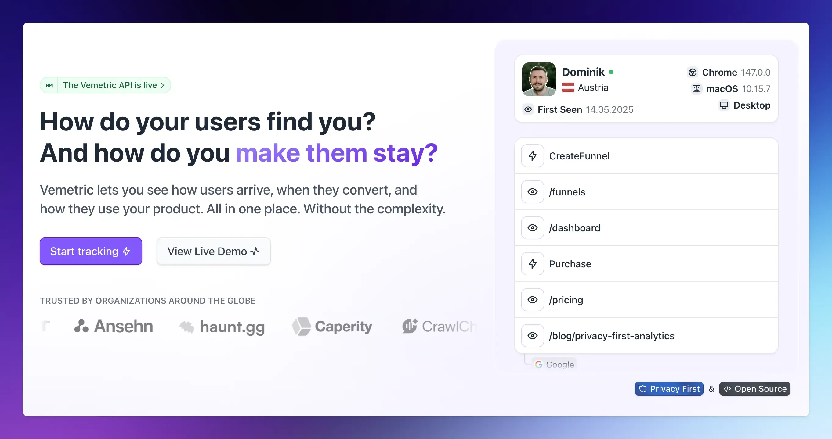
You get to see both the aggregate pattern (is the funnel improving?) and the individual story (what did this specific retained user actually do?) in the same place.
FAQs
Yes. Product-market fit is about demand and retention, not revenue scale. A product with 200 free users who keep coming back every week, invite their colleagues, and get upset when it goes down can show stronger PMF signals than a product with 2,000 paying customers who quietly churn after month one. Revenue tends to follow PMF, not the other way around, though it eventually becomes one of the confirming signals.
No. Most of what’s covered here (retention by cohort, activation funnels, referral source tracking, individual user journeys) can be set up directly in a product analytics tool without SQL or a dedicated analyst. The setup work is mostly deciding which event represents real value in your product, then tracking that consistently.
Traction is momentum: signups going up, some press, a few excited customers. Product-market fit is durability: that momentum holding up in your retention curves months later, without you having to keep pushing.