Your overall retention rate can look fine while your product is quietly losing the exact users you need to keep.
That happens because a single retention number blends every user you have ever had into one average.
New users, old users, users from a marketing campaign that flopped, users from your best-performing channel.
Averaged together, a serious problem in one group can hide behind healthy numbers in another.
Cohort analysis fixes this by splitting users into groups based on when they joined or what they did, then tracking each group separately over time.
It’s the difference between knowing “70% of users are still active” and knowing “users who signed up after your March pricing change retain 20 points worse than everyone else.”
This guide covers what cohort analysis actually is, how to build one correctly, how to read the resulting retention curve without drawing the wrong conclusion, and how to turn the insight into a fix.
What Is Cohort Analysis in SaaS Analytics?
Cohort analysis is a method of grouping users who share a common starting point, most often a signup date, and measuring what percentage of that group is still active at fixed intervals afterward (day 1, day 7, day 30, and so on).
Instead of asking “how many users are active this month,” a cohort question looks like this: “Of the 400 people who signed up in the first week of June, how many were still active 30 days later?”
The basic formula for a single cohort’s retention at any point in time is:
Cohort Retention Rate = (Users from the cohort still active in period N ÷ Total users in the cohort) x 100
Run that calculation for every period after signup and plot it, and you get a retention curve, a visual line showing exactly where and how fast a group of users drops off.
Cohort analysis isn’t a finance concept, and it isn’t the same as customer segmentation, although the two work well together.
Segmentation asks “who are my users?” Cohort analysis asks “how does a specific group of users behave across time?” You can (and should) combine them, for example by segmenting a cohort by acquisition channel to see whether paid signups retain differently than organic ones.
The 3 Types of Cohorts Worth Tracking

Not every cohort answers the same question. Most product teams end up using a combination of these three:
- Acquisition cohorts: Users grouped by when they signed up (by day, week, or month). These are the easiest to set up and are best for spotting whether retention is trending up or down as your product and onboarding evolve.
- Behavioral cohorts: Users grouped by an action they took, rather than when they joined, for example, everyone who completed onboarding, invited a teammate, or hit a usage milestone in their first week. These answer “why,” not just “when.”
- Predictive cohorts: Users grouped by a signal that correlates with future churn or expansion, such as a drop in login frequency or failure to reach a key feature. These are more advanced and typically come later, once you already trust your acquisition and behavioral data.
A useful pattern: start with an acquisition cohort to confirm there is a retention problem, then build a behavioral cohort to isolate what separates the users who stayed from the users who left.
How to Do Cohort Analysis for SaaS: A Step-by-Step Guide

Step 1: Pick your cohort unit
Decide what defines the start of a cohort. Signup date is the default and usually the right starting point.
But for SaaS specifically, it’s often more useful to cohort by the date a user completed onboarding, activated a key feature, or converted from trial to paid. The unit should match the question you’re actually trying to answer.
Step 2: Choose your time interval
Weekly cohorts work well for most B2B SaaS products, since usage cycles are often longer than a consumer app’s daily habit loop. High-frequency products (daily-use tools) may need day-level cohorts to catch early drop-off; low-frequency products (monthly reporting tools, for example) may need monthly cohorts to avoid false alarms from normal usage gaps.
Step 3: Define what counts as “retained”
Be specific. “Active” should map to a real, meaningful action inside your product, not just a login. A user who logs in and closes the tab isn’t retained in any way that matters to your business. Tie your retention definition to the same activation event you’d use to measure onboarding success.
Step 4: Build the retention table or curve
Lay each cohort out as a row, with columns for each period since signup (Day 0, Day 7, Day 14, Day 30, and so on), showing the percentage of that cohort still active in each period. Reading down a column across cohorts shows you whether retention at that specific milestone is improving or worsening release over release.
Step 5: Slice cohorts by behavior, not just by date
Once you’ve spotted a cohort that’s retaining worse than others, layer in a second filter, such as acquisition channel, plan tier, company size, or a specific onboarding action. This is where acquisition cohorts turn into behavioral cohorts and where the actual “why” behind a retention dip usually surfaces.
From Insight to Action: What to Do With Cohort Data
Cohort analysis is only useful if it changes what your team does next. A few common patterns:
- Steep drop-off in the first session or two: points to an onboarding or activation problem. Compare the paths of users who stayed against those who left in the same cohort to find the missing step.
- A specific channel’s cohorts underperform others: points to an acquisition-quality issue, not a product issue. That channel may be bringing in users who were never a great fit.
- Retention worsens for cohorts after a specific release: points to a regression. Cohort data, tracked weekly, is often the fastest way to catch this before it shows up in a lagging churn report.
- A behavioral cohort (users who completed a specific action) retains far better than the rest: that action is a strong candidate for your activation event, and it’s worth designing onboarding to push more users toward it faster.
Using Vemetric to Track Retention Cohorts Without the Overhead
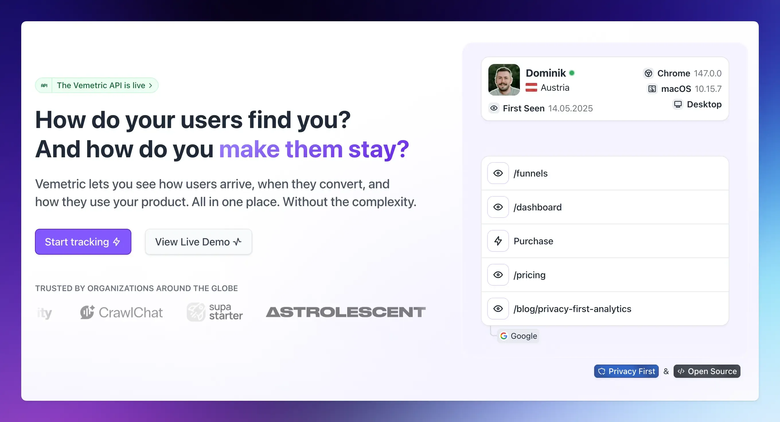
Most cohort analysis tools force a choice: a simple analytics dashboard that can’t segment deeply enough to build a real cohort, or an enterprise platform with a retention-grid feature buried under a pricing tier and a steep setup process.
Vemetric sits in between. It’s built around the two things cohort analysis actually depends on: clean event tracking and flexible filtering, without the implementation weight of larger platforms.
Here’s how the pieces map to the workflow above:
- Combine multiple filters to define a cohort: Vemetric lets you stack filter conditions, for example, signup date range plus plan tier plus a specific event, to isolate the exact group of users you want to study. The dashboard’s filtering and segmentation are built specifically to create these custom user segments and cohorts.
- Save the cohort and reuse it: Once you’ve defined a cohort worth watching, save the filter and reapply it across the Dashboard, Users, Events, and Funnels views instead of rebuilding it every time.
- Track the cohort’s conversion over time with Funnels: Map your activation event as a funnel step and filter it to a specific cohort to see aggregate drop-off, alongside individual funnel progress for any single user in that group.
- Inspect individual retention with User Journeys: Every user in a cohort has a full timeline: sessions, events, and an activity heatmap showing exactly when their engagement dropped off, which turns a retention percentage into a concrete, readable story.
Vemetric is also cookie-free by default, GDPR-compliant with EU-based servers, and open source, so the cohort data you build stays yours and auditable.
A dedicated point-and-click retention curve view is on the roadmap alongside reusable user segments, but the filtering and funnel foundation already available today covers most of the cohort workflow described in this guide.
You can start tracking for free, with paid plans starting at $5/month once you outgrow the free tier’s event limit, so there’s no reason to keep guessing at retention when the data to answer it properly is a few minutes of setup away.
If churn is the bigger question behind your retention dip, our guide on SaaS churn analytics using behavioral data goes deeper into diagnosing why cohorts are leaving, and our guide to user activation covers how to find and instrument the event most likely to predict who stays.
FAQs
A standard retention rate is a single blended number across your entire user base for a given period. Cohort analysis breaks that same population into groups based on when they joined or what they did, then tracks each group separately.
They’re related but not identical. Segmentation groups users by shared traits at a point in time, such as plan tier or industry. Cohort analysis groups users by a shared starting point and tracks that group across time. In practice, the most useful analysis combines both, segmenting a cohort to find out which subgroup is driving a retention change.