Most SaaS dashboards report one number that founders love, and investors ask about: total signups.
It feels like progress. But signups measure curiosity, not commitment.
Somewhere inside that number is a small group of users who log in constantly, explore every feature, invite their teammates, and would be genuinely upset if your product disappeared tomorrow. The rest are just passing through.
Finding that small group your power users is one of the highest-leverage things you can do with your analytics.
They show you what your product is actually good for, which features to build next, who to interview for case studies, and who is most likely to upgrade, renew, or refer someone else.
This guide covers what a power user actually is, how to spot one in your own data, and how to build a simple scoring system so you stop guessing and start knowing.
What Is a Power User, Really?
A power user is not simply someone who logs in a lot. Login frequency is a start, but it misses depth. A useful definition combines four signals:
- Frequency: they return often, on a cadence that matches how your product is meant to be used (daily for a workflow tool, weekly for a reporting tool, and so on)
- Depth: they use multiple features, not just the one that got them through onboarding
- Tenure: they have stuck around across billing cycles, not just the first free week
- Advocacy: they invite teammates, leave feedback, or mention your product unprompted
Compare that with an “active user,” the metric most dashboards actually show.
Monthly Active Users (MAU) counts anyone who opened the app once in the last 30 days, whether they used it for five hours or five seconds.
A power user is a small, specific slice inside that broader active user count, and treating the two as the same thing is where most engagement analysis goes wrong.
Why Finding Power Users Matters More Than Chasing Signups
Most SaaS revenue does not come evenly from every account.
It tends to follow a pattern known as the Pareto principle: a small share of customers generates a disproportionate share of results, often summarized as roughly 20% of customers driving around 80% of revenue.
The exact split varies by business, since it is a rule of thumb rather than a fixed law, but the underlying imbalance shows up almost everywhere you look.
Product-led growth data backs this up from a different angle.
Industry benchmarks compiled by PLG researchers show that the strongest product-led companies reach net revenue retention above 120%, meaning existing customers alone grow the business before a single new logo is added.
Those numbers do not come from your average user. They come from the power users who add seats, upgrade tiers, and stay for years.
There is also a retention cost argument. It is well established that acquiring a new user costs three to six times more than retaining an existing one.
Your power users are the cheapest revenue you already have. Chasing a bigger top-of-funnel number while ignoring who they are means spending more to replace people you could have kept happy for less.
For the fuller picture on how retention ties into product decisions, our guide on SaaS churn analytics breaks down how behavioral data predicts who is about to leave, which is the mirror image of this problem.
The Problem with Vanity Metrics (and What DAU/MAU Actually Tells You)
Total signups, total registered users, even Monthly Active Users: these numbers only grow.
They rarely tell you whether people are getting value, and they hide your most engaged SaaS users inside a much larger pool of people who tried your product once and never came back.
A sharper lens is stickiness, usually measured as the ratio of Daily Active Users to Monthly Active Users (DAU/MAU).
It answers a more useful question: of the people who used your product this month, how many came back today? According to Gainsight’s product metrics guide, the average DAU/MAU ratio across SaaS products sits around 13%, while ecommerce tools average closer to 9.8% and finance products around 10.5%.
Daily-use, workflow-critical B2B products can run well past that baseline once you account for weekends and holidays.
The exact number matters less than what you do with it. A rising DAU/MAU can hide a real problem: if you win back lapsed casual users with generic “we miss you” emails, MAU grows faster than DAU and your stickiness score actually drops, even while the top-line number looks healthy.
This is exactly why the aggregate ratio is not enough on its own. You have to break it down by segment to see where the real engagement lives.
How to Identify Power Users in Your SaaS: A Step-by-Step Framework
This is the practical part: pairing behavioral event data with a simple, repeatable process, which is what power user identification analytics comes down to once you strip away the jargon.
1. Define what “engaged” means for your specific product
Skip generic definitions like “logged in.” Pick the one or two actions that represent your product’s core value, the moment a user experiences the thing they signed up for. Our guide on user activation covers how to find that moment if you have not defined it yet.
2. Track the events that actually matter
Pageviews alone will not show you who is a power user. You need custom event tracking on the actions that prove real usage: projects created, reports exported, integrations connected, teammates invited.
3. Look at frequency and recency together
A user who did one big thing three months ago is not the same as one who does something small every week. Weight recent, repeated behavior higher than a single burst of activity from long ago.
4. Segment by depth of feature adoption, not just visit count
Someone who only ever touches one feature is not using your product to its full value, no matter how often they log in. Our feature adoption rate guide has the formulas for measuring this properly.
5. Layer in qualitative signals
Feature requests, upgrade inquiries, referrals, and glowing support tickets are all soft signs of a power user. They will not show up in raw event counts, but they confirm what the data is already telling you.
6. Look at individual users, not just averages
Aggregated charts hide outliers. Before you finalize a definition of “power user,” open the actual account history of a handful of your best customers and see what they really did in their first 30, 60, and 90 days.
Build a Simple User Engagement Scoring Model

You do not need a data science team to build a usable engagement score. A basic points system, reviewed and adjusted every quarter, gets most SaaS teams most of the way there.
- Completed core action: +3
- Returned within 7 days of last visit: +2
- Used 3 or more distinct features: +3
- Invited a teammate: +4
- Upgraded plan or added seats: +5
- Only viewed marketing or pricing pages: 0
- No activity for 30+ days: -5
Add up the points over a rolling 30 or 60-day window, then sort your users into tiers:
- Power users: consistently high scores, usually the top 5 to 15% of your accounts
- Core users: steady, moderate engagement, your reliable middle
- At-risk users: declining scores, worth a check-in before they churn
- Dormant users: no meaningful activity, candidates for a win-back campaign or removal from active marketing
The exact weights matter less than reviewing them against real outcomes. Pull a list of your top-scoring users after 90 days and check it against who actually renewed or upgraded. If the two lists barely overlap, adjust the weights.
How to Find Your Best Customers Using Product Data (With Vemetric)
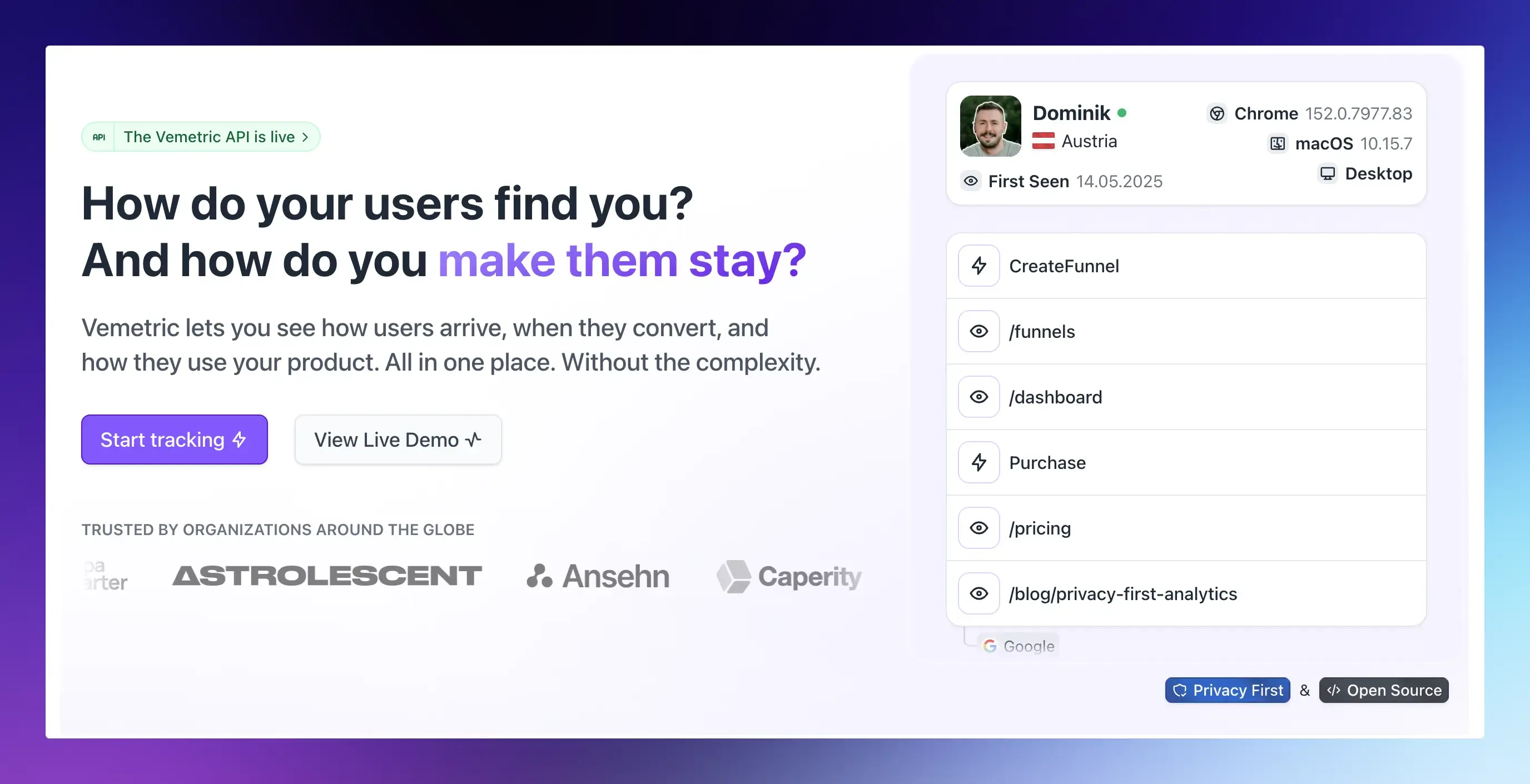
Most of what is described above requires a tool that can show you individual user behavior, not just site-wide averages.
Here is how that actually looks in Vemetric.
Start with the Users list
Vemetric’s Users view lists every visitor, sorted by last activity, and lets you filter by any event, user property, or attribute.
Filter for users who fired your core moment event 5 or more times in the last 30 days, and you already have a rough first pass at your power user segment.
Combine filters to narrow further
You can stack conditions, for example, event is Project Created, device type is desktop, and in the last 30 days, to build a more precise segment.
Save that combination as a saved filter so you or your team can reopen the same power user segment anytime, without rebuilding it from scratch.
Open individual user journeys
Click into any user, and you see their full timeline: every event, grouped by day and session, plus an interactive activity heatmap showing exactly which days they were most engaged.
This is where quantitative scoring meets qualitative understanding. You can see the actual path a power user took from signup to daily habit, then look for that same path in your other users.
Check first seen and funnel progress
Each user profile shows where they came from, which page they saw first, and their progress through any funnels you have built.
If your power users share a common entry point or referral source, that is a signal worth acting on in your marketing.
Vemetric will not hand you an automatic “power user” label out of the box, since no single scoring model fits every product.
What it gives you is the raw filtering, event data, and individual user journeys to build your own definition and keep it current as your product changes.
You can see this in action on the live demo dashboard, or start tracking for free and build your first power user filter today.
What to Do Once You’ve Found Your Power Users
Identifying power users only pays off if it changes what you do next.
- Interview them: A short 15-minute call with 5 to 10 power users usually reveals more about your product’s real value than months of survey data.
- Turn them into case studies: Their specific results and workflows make far more convincing marketing than generic feature lists. Our customer journey analytics guide covers how to map the path they took, which is exactly the story a case study should tell.
- Prioritize your roadmap around their usage: If your power users all lean heavily on one feature area, that is a strong signal for where to invest next.
- Build a referral or advocate program targeted at them specifically: They are the most likely to actually recommend you, so make it easy.
- Look for expansion revenue: Power users on smaller plans are your best upgrade candidates. They already get the value; they just need the right nudge or the right plan.
- Recruit them as beta testers: They are engaged enough to give you fast, useful feedback on things you have not shipped yet.
FAQs
Yes. In product-led growth motions, highly engaged free users are often called product-qualified leads, and they tend to convert to paid at a much higher rate than average signups. Tracking their behavior early helps you prioritize who to reach out to before a trial ends.
Not always. Some power users are on smaller plans but use the product heavily, which makes them strong candidates for upselling. Some large accounts pay well but barely use the product, which puts them at higher churn risk despite the revenue they bring in today.