🔖 Saved Filters
You can now save filters in Vemetric and reuse them whenever you need them again.
This is especially useful for filter combinations you use often, like a specific segment of users, traffic from a campaign, or visitors who completed a certain funnel step.
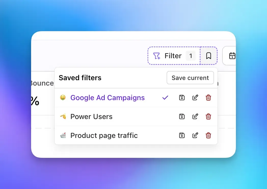
Saved filters are available directly next to the filter button, so you can quickly apply them across your dashboard, users, events, and funnels without rebuilding the same filter setup every time.
Huge shoutout to curet for contributing this feature ❤️