Pricing Page Analytics for More Signups in 2026
Your pricing page is one of the most important pages on your SaaS website.
Every visitor who lands on this page is a potential customer evaluating whether your product is worth their money.
Yet most product owners spend very little time analyzing what actually happens on that page.
Pricing page analytics helps you track and analyze behavioral data from your pricing page.
When done right, it tells you where users get confused, which plan they consider first, and what finally pushes them to click that signup button.
This guide breaks down everything you need to know about pricing page analytics, including which metrics to track, how to analyze user behavior, and which tools can help you optimize your pricing page with minimal effort.
Why Your Pricing Page Deserves More Attention
Most SaaS teams obsess over their landing page, blog, or onboarding flow.
The pricing page is updated once every few months, then forgotten. That is a big mistake.
Pricing page conversion rate is a direct measure of how well your product communicates value.
Even a small improvement here can increase monthly recurring revenue without spending a dollar more on ads.
The problem is that most teams lack visibility into what is actually happening on the page. They know how many people visited, but they don’t know how many scrolled to the bottom or where they dropped off without signing up.
This matters for three reasons.
- SaaS products see year-over-year price inflation of 8.7%, and buyers are actively comparing options before committing. If your pricing page is confusing, they will go to a competitor.
- AI agents and large language models scan your pricing structure to answer questions like “What does this tool cost?” or “Which plan is right for small teams?”. If your pricing page is not visible in AI search, a competitor will take your place.
- The difference between a poorly optimized pricing page and a high-converting one is massive. A 5% improvement in pricing page conversions can increase revenue by 25% to 50%.
Key Metrics To Track on Your Pricing Page
Before you can improve anything, you need to measure the right things. Here are the specific numbers you should track for pricing page optimization.
- Pricing Page Conversion Rate: This is the percentage of visitors who go on to sign up or start a trial. Industry benchmarks for SaaS pricing page conversion rates range from 1-5% on average, but anything below that is worth investigating.
- Plan Distribution: This metric tells you which pricing tiers visitors actually choose. If 80% of your signups come from the Basic plan and only 5% from the Pro plan, your pricing structure does not align with customer needs. Also, track how many visitors toggle between monthly and annual billing before making a decision. High toggle rates often indicate confusion about what each plan includes.
- Feature Exploration Data: Users do not just look at prices. They also explore features before making a decision. Track which features get the most attention, which ones get ignored, and how much time users spend reading feature descriptions. The average SaaS pricing page lists 47 features, while top performers list only 9. The difference in conversion rates between the two, 23.4% vs. 2.1%, is evident. If users spend too much time reading features, you probably have too many.
- Drop-off Points: Identifying drop-off points helps you determine what needs to be fixed. Do visitors leave immediately after landing? Do they click the annual toggle, scroll to the comparison table, and then bounce? A high drop-off rate may indicate that your CTAs are ineffective, or the price is too high.
- Time Spent on Page: How long do visitors spend on your pricing page? Very short sessions usually mean the page did not answer their key question. Very long sessions might mean they are confused. Users scan tier names, prices, and main features within the first 30 seconds.
- Scroll Depth: How far do users scroll before they leave? If most visitors never reach your plan comparison or FAQ section, that content is invisible to them, no matter how good it is.
- CTA Click-Through Rate: Out of everyone who lands on your pricing page, how many click any signup button at all? A low click-through rate suggests your page isn’t compelling enough to drive action. Rage-click rate shows when users repeatedly click the same element out of frustration. It usually means something looks clickable but isn’t, or that a button isn’t working as expected.
Pricing Page Analytics: How to Get the Data You Need
To track these metrics, you need the right tools. A complete pricing analytics stack includes several components.
- Web Analytics: Tools like Google Analytics give you basic website traffic data, page views, bounce rates, and referral sources. This is the starting point that tells you where a visitor came from and what happened after they landed.
- Product Analytics: Product analytics tools track specific user actions and answer questions like “Which plan did users click on first?” or “How many users started the signup flow but never completed it?”
- Heatmaps and Session Recordings: Heatmaps show you where users click, scroll, and hover. Session recordings let you watch individual user journeys. These tools reveal friction points that numbers alone cannot explain.
- A/B Testing Platforms: A/B testing tools let you test different pricing pages, layouts, or pricing tiers with real users.
Tracking Plan Selection Behavior: Why It Matters
Understanding how users choose between your pricing tiers is essential for SaaS pricing optimization.
Before you make a single change, you need to know what users actually value, not what you believe they value.
The Psychology of Plan Choice
Most SaaS teams design pricing pages by listing features logically and assuming users will do a rational cost-benefit analysis.
But users do not make decisions that way. They decide based on emotion, then justify with logic.
For example, “Don’t lose important files when you hit your limit” converts better than “Get 50% more storage”. People fear losing something more than they value gaining something.
Anchoring (or cognitive bias) affects perception and decision-making. Your most expensive plan is not just meant to sell. It makes your middle plan look reasonable. Show the enterprise price first, and your medium plan suddenly feels like a better deal.
Three plans convert better than five plans. When users see too many options, their brain defaults to “I will decide later,” which means never.
Segmenting by Customer Type
Different users have different relationships with pricing. Chargebee’s 2025 Global Consumer Insights report identified five distinct consumer archetypes.
- Flight Risks: They have high churn vulnerability. The best way to retain them is through pause options and easy downgrades.
- Growing Spenders: These are confident spenders who are open to expanding their subscriptions. They benefit most from flexibility and a clear value proposition.
- Price Sensitives: They are value hunters who want cost justification and have tight budget constraints. They stay loyal when treated fairly.
- Power Users: They have low churn risk and high customer lifetime value. They are willing to pay a premium for better experiences.
- Upgrade Enthusiast: These consumers have a high interest in usage-based and hybrid pricing models.
Your pricing page analytics should track which specific customer segments have higher conversion rates and whether your plans appeal to the right users.
Build Your SaaS Pricing Optimization Strategy
Here’s how you can implement a pricing page analytics strategy for your SaaS.
Set Up Event Tracking
- Install an event tracking tool to track both web and product analytics.
- Track all key events, including page visits, plan selections, CTA clicks, and signups.
Use Funnels and Heatmaps
- Create funnels for key user flows, such as the pricing page-to-signup funnel and the trial-to-paid conversion funnel.
- Track conversion rates between each funnel stage.
- Install pricing page heatmaps to see plan selection behavior in a visual format.
- Focus on click maps, scroll maps, and session recordings.
Establish Baselines
- Record your current conversion rate, plan distribution, and CTA click-through rate before making any changes.
- You need these numbers to measure improvement.
Once you have baseline data, you are ready to run experiments.
The key rule is to test one thing at a time and use your pricing experiments tracking data wisely. Changing plan names, CTA copy, and pricing layout all at once makes it impossible to know what actually works.
Start with testing different CTA button labels to see whether showing or hiding a “most popular” badge changes plan distribution, or if adding a short FAQ section increases conversion rates.
Unified Analytics with Vemetric
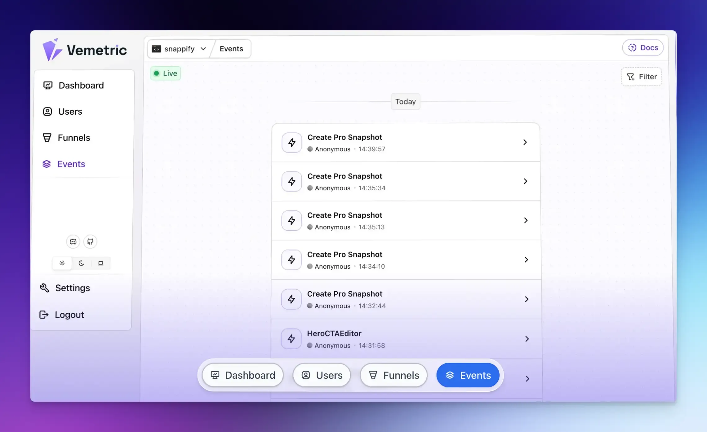
Most SaaS teams end up using multiple tools for web analytics, product analytics, and heatmaps.
Vemetric provides a unified tracking for your marketing site, web app, and other touchpoints in a single platform.
You can track events such as page views, signups, feature clicks, toggle interactions, and billing actions in one place.
Beyond page views, it tracks user behavior in context, connecting what someone does on your pricing page to what they do afterward in your product or signup flow.
Vemetric also lets you build pricing funnel analysis flows to see exactly where users drop off. You can define a sequence and see how many users complete each step and where they fall off.
For example, if you have 1000 pricing page visitors, 700 view plans, 150 click the CTA, 100 complete signup, and 30 become paying customers, each drop-off point needs attention.
This is far more useful than just knowing your final conversion rate.
Final Words
Pricing page analytics is the foundation of any serious SaaS pricing optimization strategy. Without this data, you are making expensive guesses about one of the most conversion-critical pages on your entire site.
Start simple with Vemetric, define your key events, and track your conversions. The patterns will become clear quickly, and so will the opportunities to improve.
FAQs
B2B pricing pages often have longer decision cycles and multiple stakeholders. A single user may visit your pricing page five times over two weeks before converting. Track return visits and time between visits. B2C pricing pages have shorter cycles and require real-time metrics such as click-through rates and cart abandonment rates.
Yes, but you need to adjust your metrics. Instead of tracking direct signups, track demo request clicks, sales call bookings, or contact form submissions. Also, track how many visitors view your contact page after viewing pricing.
GDPR, CCPA, and similar laws worldwide restrict how you track user behavior. You need consent for non-essential cookies and tracking. However, many privacy-first analytics tools like Vemetric work without cookies and use anonymized data, reducing compliance burden.
Ready to understand your users?
Start tracking