The average onboarding checklist is completed by just 19.2% of users who start it, and at a typical company that figure is even lower, at a median of 10.1%.
Read that twice. At most SaaS companies, roughly nine out of ten new users never tick off every box on the checklist built to help them succeed.
Most product teams already suspect this. What they usually don’t have is the next layer of the answer: which box. Is it the profile setup step?
The “connect your data” step? The item buried fourth on the list that almost nobody reaches, because the second item already lost them?
That gap is what onboarding drop-off analytics exists to close.
Not “how many people finished onboarding,” but “where, precisely, did the people who didn’t finish stop, and what happened right before they left.”
This guide covers what onboarding drop-off analytics means, why checklist completion rate hides more than it reveals, where users most commonly quit, and how to set up step-by-step funnel tracking with a tool like Vemetric without needing a data analyst on staff.
What is Onboarding Drop-off Analytics?
Onboarding drop-off analytics is the practice of measuring, step by step, where new users stop progressing through your onboarding flow, so you can find the exact point of abandonment instead of settling for one overall completion percentage.
A checklist completion rate is a single number. It tells you how many people finished. It tells you nothing about:
- Which specific step someone was on when they left
- Whether they got stuck and gave up, or got what they needed and moved on early
- Whether one bad step is dragging down five other steps that work fine
Onboarding drop-off analytics replaces that single number with a sequence.
Each checklist item becomes a step in a funnel, and you get a conversion rate between every pair of steps, not just from the first one to the last.
This distinction matters because averages hide the problem’s shape.
A 45% completion rate could mean a flow that leaks evenly at every stage, or it could mean five smooth steps followed by one step that loses 70% of everyone who reaches it.
Only step-level data tells you which one you’re actually dealing with, and only the second version tells you exactly what to fix.
Why Your Onboarding Completion Rate is Hiding the Real Problem

A saas onboarding completion rate treats onboarding as pass or fail. In practice, it’s a funnel with several drop-off points, and the checklist number only reports the very end.
Here’s why that’s a problem in practice:
- Completion doesn’t equal value: A user can check every box on your list and still never understand what your product actually does for them. Onboarding is the user activation moment the moment they get the point and a checklist can hit 100% completion while activation stays flat.
- The average activation rate across B2B SaaS sits at 37.5%, meaning close to two-thirds of new signups never reach the moment your product is supposed to prove its value. That gap between “finished the checklist” and “actually activated” is exactly what a single completion metric can’t show you.
- Activation rate itself swings hard by category. Product-led companies average around 34.6% activation versus 41.6% for sales-led companies, and AI and ML products lead the pack at 54.8% while fintech trails at just 5%. If you’re only benchmarking against “the average SaaS company,” you may be comparing yourself to the wrong business shape entirely.
The fix isn’t a better checklist. It’s watching the checklist as a funnel, so completion rate stops being the only number you have.
How to Track Onboarding Drop-off Step by Step
This is the actual workflow: turn your checklist into an instrumented funnel, read it correctly, and use what you find to fix one step at a time.
Step 1: Turn Every Checklist Item Into a Funnel Step
Each item on your onboarding checklist should map to something trackable, either a page a user visits or a specific action they take.
In Vemetric’s Funnels, each step can be a pageview or a custom event, and a funnel supports up to 10 steps.
So a typical onboarding checklist turns into a funnel like:
- Signed up
- Verified email
- Completed profile
- Connected first integration or imported data
- Completed core action (the one that matters)
- Invited a teammate
Build it exactly as your checklist reads. The point isn’t to redesign onboarding yet, it’s to see it clearly first.
Step 2: Read Drop-off Rate Per Step, Not Just the End Number
Once the funnel is live, ignore the overall completion percentage at first and look at the conversion rate between each consecutive pair of steps.
A funnel view should show you, per step:
- The absolute number of users who reached it
- The conversion rate from the step before
- The drop-off rate at that step
- The overall end-to-end conversion
If steps 1 through 4 each convert above 80%, but step 5 converts at 30%, you’ve found your bottleneck. That’s one fix, not a full onboarding redesign.
Step 3: Filter by Segment Before You Blame the Step
A step that looks broken in aggregate is sometimes only broken for one segment.
Filter the funnel by signup source, plan, device, or persona before you decide what’s actually wrong.
Self-serve signups and sales-assisted trials often stall at completely different points.
A mobile user might drop at a step that a desktop user sails through.
Segment filters (which you can save and reuse on future funnels) turn “this step is broken” into “this step is broken for trial users on mobile,” which is a much easier problem to fix.
Step 4: Watch the User Journey at the Exact Point They Quit
A funnel tells you where users drop. It doesn’t tell you why. That’s what individual user journeys are for: the full, ordered path a specific person took through your product before they stalled.
Open the journey of a handful of users who dropped at your worst-performing step and look for patterns:
- Did they bounce between two pages, apparently looking for something?
- Did they hit an error and never come back?
- Did they open the step, sit for a few seconds, and leave?
A dozen real journeys will usually explain more than another week of staring at the aggregate number.
Step 5: Fix One Step, Re-measure, Repeat
Change the one step you’ve identified, not the whole flow. Then compare the funnel for users who signed up after the change against the baseline you already have.
Track whether the step’s conversion rate moved, whether that shift pulled the overall completion rate up, and whether a new bottleneck appeared somewhere else. It usually does.
Onboarding drop-off analytics is a loop you run continuously, not a report you pull once and file away.
How Vemetric Helps You Find the Exact Step Where Users Quit
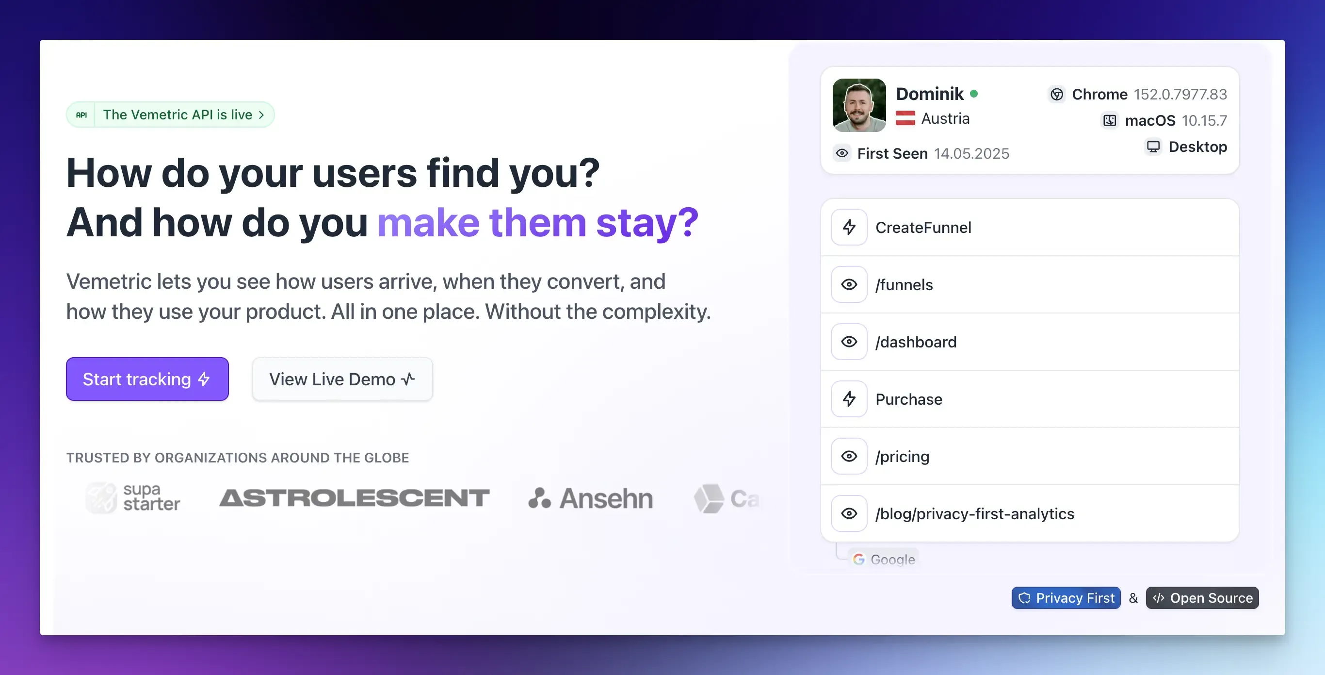
Vemetric is a privacy-first web and product analytics tool built to answer this question: not just how many users completed onboarding, but where the rest stopped.
- Funnels map your checklist step by step (up to 10 steps per funnel, each one a pageview or a custom event) and show the absolute numbers, conversion rate, and drop-off rate at every stage, in either a horizontal or vertical view.
- Segment filters, reusable and saveable, let you see how different user groups convert differently through the same funnel, so you’re not fixing a step for everyone when it’s only broken for one segment.
- An active users toggle shows funnel performance relative to your entire active user base, not just the people who entered the funnel, so you can see what share of your total users are even reaching onboarding.
- User journeys merge each person’s anonymous and logged-in activity into one timeline, with an interactive activity heatmap, so you can open the exact users who dropped at your worst step and see what they were doing.
- A 7-day funnel window gives users a full week to complete each step, so short absences don’t get miscounted as drop-off, and you can view any individual user’s progress across every funnel you’ve built.
- Event streams show what’s firing in real time, so you can confirm a fix works before waiting on a full cohort cycle.
Vemetric is also GDPR-compliant, EU-hosted, cookie-free by default, and open source. It’s free to start on smaller projects, with paid plans beginning at $5 a month as you scale.
FAQs
Onboarding drop-off happens before a user ever reaches the point of getting value from your product, while churn happens after someone has been an active (often paying) user and then leaves. Drop-off is measured in steps and minutes; churn is measured in days, weeks, or billing cycles. Fixing drop-off is usually cheaper because you’re keeping a user you already paid to acquire from leaving before they ever got a chance to see the product work.
Yes. Cookie consent applies to tracking methods, not to measuring a funnel. Tools like Vemetric track onboarding funnels and user journeys without cookies by default, using a daily-rotating hash instead, which keeps you GDPR-compliant while still giving you full step-by-step visibility into where users drop off.