A green status in your CRM doesn’t mean much if nobody has checked the product data behind it. NPS tells you how someone felt on one particular day. A renewal date tells you what already happened.
A customer health score is one of the only metrics built to tell you what’s happening right now, early enough to do something about it still.
The economics of this are hard to ignore. Bain & Company’s research on customer loyalty found that increasing customer retention by just 5% can increase profits by 25% to 95%, depending on the industry.
That kind of leverage is exactly why more B2B SaaS teams want a reliable health score. The problem is that most guides hand you a generic formula with made-up weights that fall apart the moment you check them against your own churn data.
This guide skips the generic template.
You’ll learn what a customer health score actually is, which product usage metrics belong in one, a step-by-step way to calculate it, a worked SaaS example, and how to turn the score into an early warning system instead of a dashboard nobody opens.
What is a Customer Health Score?
A customer health score is a single number, letter, or color that represents how likely an account is to renew, expand, or churn.
It’s built by combining signals from product usage, support interactions, and the commercial relationship into one composite metric.
A few things set it apart from other customer metrics:
- It scores accounts, not individual users: In B2B SaaS, one disengaged user inside a 40-seat account isn’t a red flag. Three inactive admins usually are. Health scoring works at the organization level.
- It’s dynamic, not a snapshot: NPS and CSAT capture how someone felt about a single interaction. A health score updates continuously as behavior changes.
- It’s meant to predict, not describe: Gainsight, one of the customer success platforms that popularized the practice, describes a health score as a blend of product usage, support history, and relationship data into one measure designed to flag risk and expansion opportunity before either shows up in a renewal conversation.
The score itself isn’t the point. What matters is whether it reliably tells your team which accounts need attention weeks before the renewal call, not during it.
Why Product Usage Data Should Anchor Your Score
Health scores built only on surveys or CSM gut feel run into two problems.
Surveys have low response rates and only capture a single moment in time. Gut feel doesn’t scale past a handful of accounts per CSM, and it can’t be audited or improved systematically.
Product usage data solves both problems:
- It’s continuous: Every session, click, and feature use adds a fresh data point, no waiting on a survey response.
- It’s objective: It reflects what accounts actually do, not what they say they’ll do on a call.
- It covers every account: Not just the ones who bother to respond to a survey.
None of this means usage data should be the only input.
The strongest health scores still blend usage with support and commercial signals.
But usage data should anchor the score, because it’s the one input you can track for 100% of your customer base without asking them for anything.
Customer Health Score Metrics That Predict Retention, Not Just Activity
Not every usage metric belongs in a health score.
Login counts and daily active users feel rigorous, but they’re often vanity metrics that don’t tell you much about whether a customer is getting real value.
Here are the categories worth building around, and the specific metrics inside each one.
Product usage and adoption depth
- Feature breadth: the number of distinct core features an account actually uses, not just logins
- Completion of core workflows end-to-end, rather than started-and-abandoned
- Depth of usage in the “sticky” features that your own cohort data shows correlate with renewal
Engagement momentum (trend, not a snapshot)
- Weekly active usage compared to that account’s own 30-day baseline, not a fixed company-wide average
- Session frequency trend over the last 2 to 4 weeks
- Seat or license utilization: what percentage of provisioned seats are actually active, and is that percentage rising or falling
Outcome and milestone metrics
- Whether the account reached its activation milestone, the moment they first experienced real value
- Recurring “value events” completed, such as reports generated, workflows run, or projects shipped
Support and friction signals
- Ticket volume trend, not just ticket count
- Error rates or repeated failed actions inside the product
- Time to resolution on open issues
Relationship and commercial signals
- NPS or CSAT, if you collect it
- Contract tenure and renewal history
- Expansion behavior, like seat additions, pricing page visits, or team invites
A useful gut check: for every metric on your list, ask what it would mean if it moved. If you can’t describe a specific action your team would take when that number changes, it doesn’t belong in the score yet.
How to Calculate a Customer Health Score From Product Usage Data
Building a health score is less about finding the “correct” formula and more about running a repeatable process.
Here’s how to do it in six steps.
Step 1: Start with your own churned and retained accounts
Before picking metrics, pull two cohorts: accounts that churned in the last two quarters, and accounts that renewed or expanded in the same period.
Compare their product usage in the 30 to 60 days before the outcome.
The behavioral gap between those two groups is your candidate metric list.
If churned accounts and retained accounts both logged in five times a week, login frequency isn’t a useful input for you, no matter how often it shows up in other companies’ health score guides.
Step 2: Pick 4 to 6 metrics, not 15
One or two metrics from each category above is usually enough.
More inputs sound more rigorous, but each additional metric adds noise you’ll eventually have to explain to your team when the score doesn’t line up with reality.
Step 3: Normalize every metric to the same 0-100 scale
You can’t average a feature count and a ticket count directly; they’re on completely different scales.
Convert each metric to a 0-100 range so they can be combined fairly.
For a count-based metric like feature breadth, that might be (features used ÷ total core features) × 100.
For a trend metric like engagement momentum, it might be a percentage change against baseline, capped and floored so a single outlier month doesn’t break the scale.
Step 4: Weight each metric by how much it actually separates your two cohorts
Don’t guess weights. Go back to the cohort comparison from Step 1. The bigger the gap between your churned and retained groups on a given metric, the more predictive power it has, and the more weight it deserves in the composite score.
Step 5: Combine the metrics and set score bands
The composite score is the sum of each normalized metric multiplied by its weight:
Health Score = Σ (Normalized Metric Score × Weight)
A common starting point is three bands:
0 to 40 as critical risk, 41 to 70 as needs monitoring, and 71 to 100 as healthy.
Calibrate your own cutoffs against your actual churn rate, not a generic template.
If your score flags 30% of accounts as at-risk and your annual churn is nowhere near that, the model is miscalibrated, not your customer base.
Step 6: Backtest before you trust it
Run the score against the last two quarters of data. Would it have flagged the accounts that actually churned, 30 to 60 days before they left?
Check your false positive and false negative rates, then adjust the weights.
Plan to revisit the whole model quarterly, and any time you ship a feature that meaningfully changes how customers use the product.
Health Score Churn Prediction: Turning the Score Into Action
A health score that doesn’t trigger anything is just a report.
The real value is in wiring the score to specific interventions, so a number moving is what starts the work, not a calendar reminder or someone happening to notice.
A simple three-tier playbook works well for most teams:
- Healthy (71-100): Candidate for expansion outreach, case study requests, or referral asks. These are your best accounts to learn from, not just protect.
- Monitor (41-70): Automated in-app prompt surfacing an underused feature that correlates with retention, or a light-touch check-in email.
- Critical (0-40): Direct outreach from a CSM or founder, ideally referencing the specific usage change that triggered the flag, not a generic “checking in” message.
Building a Customer Health Score in Vemetric
You don’t need a dedicated customer success platform to start building a usage-based health score.
Most of the raw material comes from product analytics you likely already have, or can start collecting today.
Here’s how the pieces map to Vemetric:
- Track the events that feed your metrics: Custom event tracking lets you capture the specific actions that matter for your product, workflow completions, report exports, invites sent, whatever your Step 1 cohort comparison surfaces as predictive.
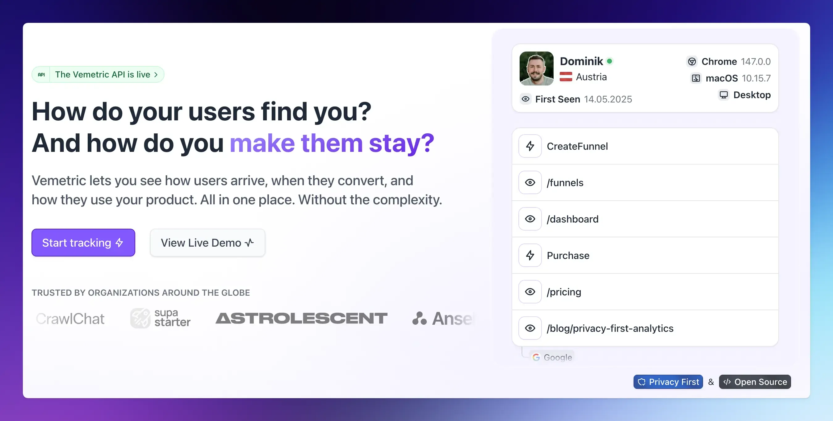
- Review individual accounts before you automate anything: User Journeys show the full timeline of events for a user or account, including an activity heatmap and funnel progress, so you can double-check what a “healthy” account actually looks like before you lock in weights.
- Build repeatable cohorts with filters: The Dashboard’s filtering and segmentation lets you combine conditions, such as a specific event fired fewer than twice in the last 14 days, and save that filter to reuse across the Dashboard, Users, Events, and Funnels views. That’s the fastest way to approximate a risk segment today.
- Store the computed score back on the user: Vemetric lets you attach custom attributes to a user through the identify or update functions in its SDKs. Once you calculate a health score in your own script using data pulled from Vemetric’s API, you can write it back as a user attribute, which makes the score itself filterable right alongside the usage data that produced it.
- Connect acquisition to retention: Because Vemetric combines web analytics and product analytics in one place, you can check whether accounts from a specific channel or landing page activate faster and stay healthier than others, tying the top of the funnel to long-term account health instead of treating them as two separate tools.
Vemetric doesn’t ship a pre-built health score dashboard today.
What it gives you is clean, per-account usage data and the flexibility to define and store your own score, which matters more, since a health score copied from a generic template rarely survives contact with your actual churn data anyway.
FAQs
NPS measures loyalty at a single point in time based on what a customer says. A customer health score is continuous and behavioral, based on what a customer actually does inside your product. Most mature teams use both, but treat the health score as the earlier, more reliable warning signal.
Product analytics tools that track per-user and per-account events, like Vemetric, give you the underlying data. You can build the scoring logic yourself using that usage data, combined with support ticket data and basic commercial data from your CRM or billing system, without needing a full customer success platform.