December 16, 2025
📊 Dashed Lines for Incomplete Data
The Chart on the Dashboard now uses dashed lines to visualize incomplete data periods.
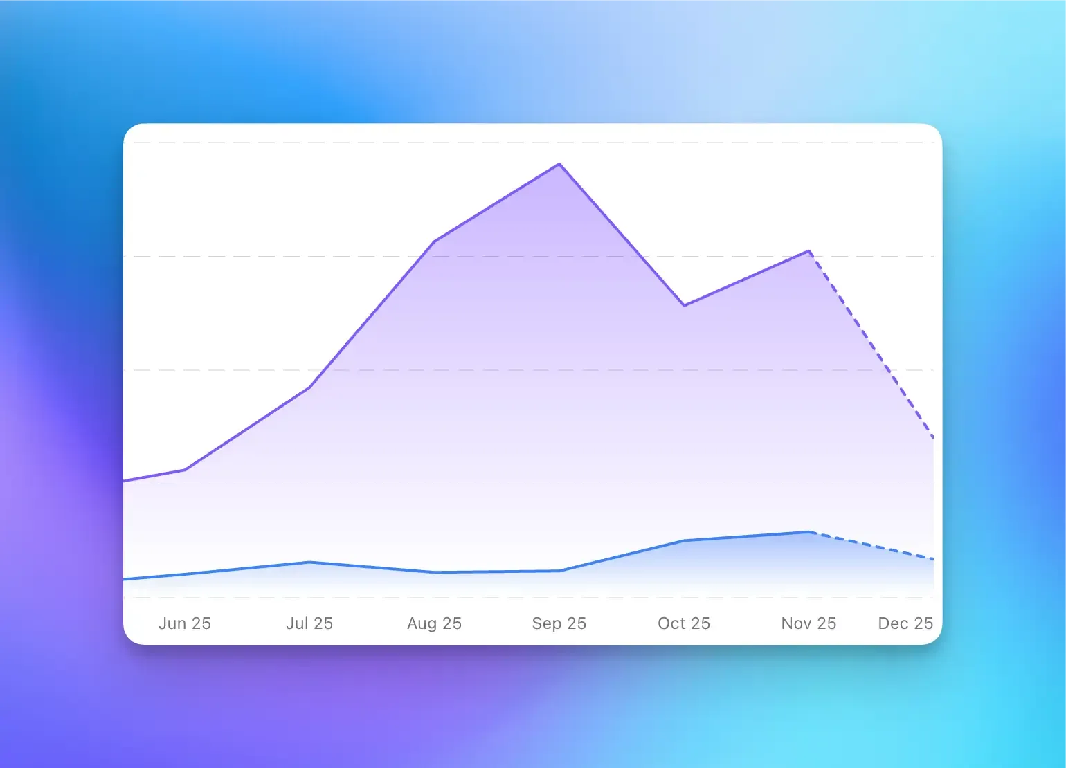
For example, when viewing time-based charts like “Last 7 days”, the current period (today), is displayed as a dashed line since the data for that period isn’t complete yet.
This makes it easier to distinguish between finalized historical data and ongoing data collection.
Ready to understand your users?
Integrate and get valuable insights with Vemetric in minutes.
Start tracking